Sunday, 13 February 2011
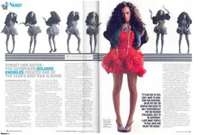
Vibe- R&B Double page spread This a double page spread from Vibe magazine this is an R&B magazine. I chose this double page spread as i like the colour scheme used on it, The main colours which are used are red, bule and pink the use of these colours are very good as they are bright and attractive and contrast well with each other and the use of red shows power. The main image is in colour and is bigger than the others and is a little of center but it still shows the readers she is the main topic of conversation and the use of image being in colour makes it stand out from everything else on the page. The black and white images used in the background are used to dominanace the main image. The blue is used to highlight the artists name to make it easier for the readers to know who she is. The text on the double page spread is small and simple and is placed around the image to highlight the importance of the image. The article features some of the conventional styles for magazines, such as columns arranged in 3 on each page and bold and big writing to show the start of an article. Quotes from the article are used at the bottom right hand of the main image to tempt readers to read the whole article. This double page can intrest readers who are in both into music and fashion as the main image is a music and style icon for many readers.
Subscribe to:
Post Comments (Atom)

No comments:
Post a Comment